Sunday, December 8, 2013

How To Load: SCRIPTS - ACTIONS - STYLES


How to load and use Photoshop Scripts.

Pencil Pixels Scripts are as easy to use as Actions. One click and the effect is generated.
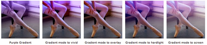
There are a number of Free Photoshop Scripts on the Pencil Pixels' site.

Download and unzip the file into a folder and put the folder where you can easily find it.

Open an image in Photoshop, then you can select the script through the
File menu >> Scripts >> Browse...  menu (as illustrated below)

Select the script from the folder you've stored it in.

or

The script can appear directly in your Photoshop script list
File >> Scripts
To do this, you just place all your scripts in the Photoshop scripts folder.

The typical location of the scripts folder is;
For Windows :    C:\Program Files\Adobe\Photoshop (CS2, 3, 4, 5)\Presets\Scripts\ 
For a MAC :   On your hard drive> Applications> Photoshop (CS2, 3, 4, 5,)> Presets> Scripts.

The Pencil Pixels Scripts are compatible with Mac and Windows Versions of Photoshop versions CS through the latest CS6.


How to load Actions into Photoshop.


Here are some easy steps to load new actions into Photoshop.

If your version of Photoshop is CS3 or later, with the Photoshop application running,
simply double click on the Action file. The new actions will appear at the end of the list of actions in the Actions Palette.

If the Actions palette is not open, select 'Actions' from the 'Window' drop down menu.


Another way of loading actions is through 
the Actions palette.
Click and hold the arrow button in the upper right hand corner of the palette.


From this drop down menu, select
'Load Actions... '.

Find the Actions file on your computer that you wish to load. The file will have a '.atn' extension.

Depending on the version of Photoshop that you have, you may be able to simply drag and drop the Action file into the open 'Actions' Palette.

The new Actions will appear at the bottom of the list in your Actions palette

* Do not select 'Replace Actions ...' or
'Clear All Actions' or 'Reset Actions...'
These selections will erase actions instead.


When you want to apply an action to an image:
1) Click the small triangle to the left of the Action-set that you've just loaded.
2) From the list, select the Action you want to apply. 
3) Press the triangle 'play' button at the bottom of the palette.


How to load Styles into Photoshop.

Pencil Pixels offers both free and for purchase Photoshop styles. There are styles for Shapes, Styles for Fonts and Frame Styles. Most are free to download.

If your version of Photoshop is CS3 or later, with the Photoshop application running,
simply double click on the Style file. The new styles will appear at the end of the other styles in your Styles Palette.


If the Styles palette is not open, select 'Styles' from the 'Window' dropdown menu.


From the Styles palette, click and hold the arrow button in the upper right corner of the palette. 

From the drop down menu select 'Load Styles...'

Locate the style file [.asl] on your computer to load.

Please note: if you select 'Replace Styles', all of the existing styles that you had will be erased. You would have to reload them from the original source files.


Using Pencil Pixels Free Glitter Styles


Pencil Pixels' Glitter Styles are a great way of adding bits of glitter to images.
Not just for the holidays, the styles can be applied to Fonts and Shapes as well.
Best Part, they are Free and this tutorial will provide you with tips for using them in a number of ways.

First things first, they can be downloaded from the Pencil Pixels site.
Like any style files, they can be loaded into Photoshop (when open) by double clicking on the .atn file, or you can load them from the styles pallet 'Load Styles ...' selection.


There are ten styles of glitter.

Like all styles, you can alter the color, the shadow intensity and the opacity to suit your specific needs.


First open an image.
Add a new layer (Styles can't be applied to the Background layer).
Select a Glitter Style to use.

Using the Paint Brush, simply draw on this layer and ... instant glitter and tinsel!


The brush you select can dramatically change the glitter style appearance.

The examples that follow use some of the standard Photoshop brushes. A brush with 100% hardness (13) is very useful for accenting smaller areas of your image.
Using a softer edge brush, like (45) will soften the edges of the effect. This is beneficial when you want to retain a dithered outline.
The numbers in the brushes' pallet represent the size of the brush. I refer to the numbers here as a 'name' to call the brush I'm referring to.


The effect of the Glitter style is pronounced when you use a brush that has dynamic properties associated with it.

You can set the dynamics yourself or use some of the preset Photoshop brushes.

(29) and (112) are brushes that are preset with dynamics that varies as the stroke progresses. The variance can be in opacity, rotation, color, size and softness.

As you see in the example, the bottom two brushes create a complex 'paint pattern' with very little effort on the part of the user.


Since the glitter styles are ... styles, they can be applied to text, to shapes, to frames or on corner deceratives. I like the look when it is applied to a thin line and used to separate content on a page.


The effect doesn't have to be overt. In the example above, I used 3 different styles to play with the image. Spot them?


With a little imagination you can start to see the possibilities. Below, I painted on different layers with different styles and brush shapes. I then reduced the opacity of the image to almost 0%, leaving the form of the tree made up of glitter. Next year I may even put a Saturation Adjustment layer on top and let the image explode with color.


In this example, I used multiple styles and brush shapes on layers that were on top of each other.  Hay, it's your imagination - I'm just giving you he tools.


Get the Free Glitter Styles at Pencil Pixels and enjoy the holidays. While your there, we have a large number of other Free scripts, fonts and styles to take an image from the ordinary to the extraordinary.

Sunday, October 27, 2013

Using Vintage, Color and Distressed looks in Photoshop - Making Bad look Good


Original image

In developing our New "lomo" files, I had to understand what lomography had to do with a social media craze. The research led me to appreciate the look that was being achieved by nostalgic, vintage, lomo developers. The feel that makes a contemporary image look like it were tinged with the remarkable beauty that someone actually cared to preserve it for all these years.

Lets see how to do this.
www.PencilPixels.com


Pencil Pixels has developed a unique way of converting your image into a vintage or distressed appearing photo.  These effects are not Actions or Scripts, but Photoshop Layer Styles!  We have two FREE sets at Pencil Pixels.  One set contains 12 Styles of Gradation Color and the other set contains 20 Styles that emulate the standard Instagram filters that are in mobile apps.  We also have 100+ Styles that can be purchased that display a variety of distressed and vintage looks.


So, it looks trendy by intentionally making it look old and neglected.  OK. So I can do that. I have more experience with making things look bad then most people. Wait, let me rephrase that. I have more experiences to draw from than most.  Having a background in the print and film processing industry, I saw what film looked like when it had been light exposed during development. I felt the irritating pain as much as the photo paper being dragged across a dirty roller. I know what a Polaroid picture turned into when the chemical compartment didn't fully empty. Lastly, I remember every Kodak print that slowly lost its green layer to the sun.
Yeah, I know lomo. I lived lomo. So you can truly appreciate that these Photoshop styles were born of fire and forged from the roots of experience.


The Basics.
After you download the Pencil Pixels styles, You load them into Photoshop. If you don't know how to load Styles into Photoshop, click here it's easy.  

Like all Photoshop styles, you can't apply a style to the Background Layer.  All you have to do is simply select the Background layer and make a duplicate layer  [Image - - Duplicate] from the Photoshop menu.
Hint: You can also double-click the Background name and rename the layer to something else. Then you can apply the Style to it.


After the layer is duplicated, select it and apply a style from the Styles Pallet window.


I selected a Violet Gradation. The effect fades the color property from top to bottom.
You can easily change the effect to enhance the image in a number of ways.


By double-clicking on the layer, where the style has been applied, a Property box will pop up. Select 'Gradient Overlay' on the right side. In the Properties box, you can change the angle of the gradient, from bottom to top as in this example. You can change it to any angle to bring out the best in your image.


You can also change the way that the color effects the image, by changing the 'Blend Mode' Property.

The Style initially comes with the blend mode set to 'Color'. By selecting a different 'Blend Mode' you can intensify or dull down the area of the image underneath the color, and achieve different color values as it mixes with the images original colors.

Example.


The difference is subtle, but it allows you to change the impact of the effect and ultimately change the feel of the image.

Screen Blend Mode

Vivid Light Blend Mode


Troubleshooting Tips.

If you're like me, I keep clicking on different styles to see what works the best with a particular image.  If the effect looks "different" then it did the last time you used it, It is a good practice to remove a previously applied style before applying a new one. With each set of Styles provided, We have a 'Remove Styles'  style to do just that. [ a white square with a red line through it ].


You are apt to have different sized images that you would want to apply these styles to. The styles were appropriately developed for web sized images. When applying to a larger image or a very small image, the effect may appear  too intense or not intense enough.

First thing to check, is that the image is 72 dpi. You definitely will have to alter the style if it is applied to a 300 dpi High Res image.

To compensate for this, and bring the effect closer to the intended look, you may have to 'Scale' the effect. To do this select [ Layer - - Layer Style - - Scale Effects... ]  from the Photoshop menu.


This dialog will pop up. Drag the slider lower or higher to Scale the effect and make the image appear as expected.


For this reason, we've also made some of the Layer Styles in the set specifically for Smaller and for Larger images to be more convenient. This is a start point for your work.


Another example of scaling the style. One of our Grunge styles was applied to a small image. Before and after scaling shows a dramatic difference.


I hope this has given you some insight into the number of ways that the Pencil Pixels Lomo Styles can be altered to make a better and versatile vintage effect.

See all the different Styles and examples on the website

Experiment and enjoy.

Pencil Pixels


Monday, September 2, 2013


Extending Value - Making more art from your Pencil Pixels Scripts.
This tutorial is based on the e-Pencil #2 script available at PencilPixels.com


It starts with a good image. Like any plug-in or action from any company, images that are blurred, or contain a lot of image noise,  or are overly compressed, dark or low in contrast, will yield poor results. Keep that in mind. 

You can adjust the opacity of layers in our scripts to increase or decrease the effect of the resulting image. Adjusting any of the the layers, for opacity, visibility or blend mode, changes the appearance of the effect and allows you to customize your end result.


Select our script from the 'Scripts' menu or 'Browse...' for it. Scripts are as simple to use as clicking on an Action.  In one click, you get this result.

You can use this as a start point to create additional appearances of your Photoshop image.  If it isn't open, select 'Layers' from the Photoshop Window menu.


In the example below, if you shut off the "Base Art 3" layer (by clicking on the icon box to the left of that layer) you can change the appearance of the effect. You can also darken the effect by turning 'on' the "Darken" layer.

You'll notice that this script generates a few layers that allow you to adjust the sharpness, lightness, darkness and texture of the effect.  Again, adjusting these layers, by their opacity, visibility or blend mode, changes the appearance of the effect and allows you to customize the result.


Another example would be to leave "Base Art 3" on and instead, turn off the "Base Art 2" layer.  

This will give a softer pencil shading effect, like using a dull or worn pencil lead.  You can soften the effect even more by turning 'off' the "Sharpness" layer.


A "Color" layer is also available for you to add splashes of color to the Pencil effect.  The color layer has a Mask associated with it.  It currently is black and doesn't allow any color to show through.  Select  a paint brush from the tool pallet and select white as the color you'll be painting with.  Important, Select the "Color" layer 'Mask' before painting.  Start painting on the image in areas that might draw viewer attention.


You can make the image look like a hand coloring by reducing the opacity of the "Color" layer.  Now, some of the Pencil effect comes through the color layer.


Another way of using the color layer is to remove the mask altogether.
(Or by selecting the mask and fill it completely with white.)

Select the "Color" Layer and change the 'Blend Mode'. The blend mode would be currently set to 'Normal'. From the drop down menu at the top of the 'Layers' Pallet, select 'Color' as the mode. This is shown in the top right area of the example image below.


Now for some more fun.
This would be a good time to select the "Base Art 3" layer and select 'Gaussain Blur' from the
Filters >> Blur >> Gaussain Blur...  menu. A small amount should do, maybe 2.5. 
Set the Opacity of the "Base Art 3" layer to 100%, it will make it appear richer.


Now to get tricky.
I went back to my original image and used the #2 Pencil Script again.
I also painted the mask area to show color on the girl's face.

In all the above examples, the "Texture" layer has been at the top of all other layers. Try increasing the opacity of the "Texture" layer a little, from 10% to 23%.  Then drag the "Texture" layer below the "Color" layer.

This really make the image POP!


One last thing I'd like to show you.
Paint some areas on the color Mask to add some color detail.
Drag the "Base Art 3" Layer above the "Color" layer
Set the 'Opacity' of this layer to 100%


Now, set the "Color" layer's 'Blend Mode' to 'Pin Light'.


Lastly, I turned 'off' the "Textures", "Sharpness" and "Pencil Gradient" layers...
A large number of the scripts and actions we develop, have these additional layers to experiment with.

I hope you have some fun!


Wednesday, August 14, 2013

Sand Art Photoshop Styles


Ahh to those days by the Jersey Shore, Day Camp Arts & Crafts and Amusement Parks. 
PencilPixels brings you Sand Art Layer Styles for Photoshop.
As simple as making a shape and selecting one of the 8 styles.

This blog will
Show some examples.
Explore some options for using it creatively.
Show how to modify the Style.
Provide some resources for Photoshop shapes used in this blog.


There are 8 styles in this set which include multi-color and single color sand patterns. Included is a Cork style, to cap off your container. There is also a 'no styles' style.


So all you need is to get started is to layout some type or to select a shape from the shapes pallet.


Then select that layer and click on a style from the Photoshop Styles pallet.


Shapes and Text are just some of the objects that you can apply this style to. Shapes, if you think about it, are nothing more than silhouettes. If you have a backlit image, just select the black portion of the image, copy and paste it. You then can apply the Sand Art style to that new layer.
With a little eraser work on the layer with the style, you can make the Sand Art 'container' appear not quite full to the top.


Experimenting with the values of the style is the best way to get unique looks. As a start point, fill a shape with with the first Sand Art Style in the set.  Lets explore the style and how to  change it's appearance.  Once the style has been applied, double click in the layer to display the styles options pallet.

You can change the color TONE, by selecting the 'Color Overlay' option and then by selecting the over all color you want. Select 'Color' from the Blend Mode dropdown, and use an opacity less than 80%.  This will change the coloration of the 'sand' pattern to that color. It adjusts the color balance of the pattern. In other words, it will retain some of the original colors of the pattern but also saturate the pattern with your selected color.


Another way of changing the style's color is by Selecting 'HUE' from the Color Blend Mode dropdown.  HUE changes all of the tones (the light and dark sand pattern tones) to a single color value. The difference of Color verses Hue?  When HUE is selected, it will display that same Hue, regardless of how light or dark or how saturated the color that you selected is.


 The pattern's default size is 105%. This produces a slightly soft pattern that helps it appear as if behind glass. You can make the appearance of the sand sharper by setting this value to 100%


 Likewise you can reduce the pattern to 50% or 25% to give the appearance of more layers of 'sand'.
Also, as with all styles that use patterns, when the 'Pattern Overlay' is selected you can drag your cursor over the image and shift the pattern's center point. This is useful with a large pattern like Sand Art so that you can offset the position the pattern and change where it begins in your shape.


Here are some examples of the styles supplied in the download that use the above variations.


The 9th style, supplied with the set, is a Cork style. I usually draw a rounded corner rectangle on the layer above the sand art, apply the 'Cork' style, and position the rectangle just above the top of the graphic.


Start with good art and get better results. Here are some Free Photoshop Shape sets from artists that are well worth a look at.


sarthony    45 Hearts       http://sarthony.deviantart.com/gallery/35297913?offset=24


hfs991hfs      Hero Shapes      http://hfs991hfs.deviantart.com/art/Hero-Shapes-82286081


Joeadonis    More Ladies    http://joeadonis.deviantart.com/art/More-Ladies-49811862


richardperkins   Assorted_Logos    http://richardperkins.deviantart.com/art/Assorted-Logos-91198824


hebedesign     Skater Collection    http://hebedesign.deviantart.com/art/Skater-Collection-28880909


Medialoot      Stiched Speech bubbles     http://medialoot.com/item/stitched-vector-speech-bubbles/


Pencil Pixels