 |
| Original image |
In developing our New "lomo" files, I had to understand what lomography had to do with a social media craze. The research led me to appreciate the look that was being achieved by nostalgic, vintage, lomo developers. The feel that makes a contemporary image look like it were tinged with the remarkable beauty that someone actually cared to preserve it for all these years.
Lets see how to do this.
www.PencilPixels.com
Pencil Pixels has developed a unique way of converting your image into a vintage or distressed appearing photo. These effects are not Actions or Scripts, but Photoshop Layer Styles! We have two FREE sets at Pencil Pixels. One set contains 12 Styles of Gradation Color and the other set contains 20 Styles that emulate the standard Instagram filters that are in mobile apps. We also have 100+ Styles that can be purchased that display a variety of distressed and vintage looks.

So, it looks trendy by intentionally making it look old and neglected. OK. So I can do that. I have more experience with making things look bad then most people. Wait, let me rephrase that. I have more experiences to draw from than most. Having a background in the print and film processing industry, I saw what film looked like when it had been light exposed during development. I felt the irritating pain as much as the photo paper being dragged across a dirty roller. I know what a Polaroid picture turned into when the chemical compartment didn't fully empty. Lastly, I remember every Kodak print that slowly lost its green layer to the sun.
Yeah, I know lomo. I lived lomo. So you can truly appreciate that these Photoshop styles were born of fire and forged from the roots of experience.
The Basics.
After you download the Pencil Pixels styles, You load them into Photoshop. If you don't know how to load Styles into Photoshop, click here it's easy.

Like all Photoshop styles, you can't apply a style to the Background Layer. All you have to do is simply select the Background layer and make a duplicate layer [Image - - Duplicate] from the Photoshop menu.
Hint: You can also double-click the Background name and rename the layer to something else. Then you can apply the Style to it.

After the layer is duplicated, select it and apply a style from the Styles Pallet window.

I selected a Violet Gradation. The effect fades the color property from top to bottom.
You can easily change the effect to enhance the image in a number of ways.

By double-clicking on the layer, where the style has been applied, a Property box will pop up. Select 'Gradient Overlay' on the right side. In the Properties box, you can change the angle of the gradient, from bottom to top as in this example. You can change it to any angle to bring out the best in your image.
You can also change the way that the color effects the image, by changing the 'Blend Mode' Property.

The Style initially comes with the blend mode set to 'Color'. By selecting a different 'Blend Mode' you can intensify or dull down the area of the image underneath the color, and achieve different color values as it mixes with the images original colors.
Example.
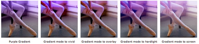
The difference is subtle, but it allows you to change the impact of the effect and ultimately change the feel of the image.
 |
| Screen Blend Mode |
 |
| Vivid Light Blend Mode |
Troubleshooting Tips.
If you're like me, I keep clicking on different styles to see what works the best with a particular image. If the effect looks "different" then it did the last time you used it, It is a good practice to remove a previously applied style before applying a new one. With each set of Styles provided, We have a 'Remove Styles' style to do just that. [ a white square with a red line through it ].
You are apt to have different sized images that you would want to apply these styles to. The styles were appropriately developed for web sized images. When applying to a larger image or a very small image, the effect may appear too intense or not intense enough.
First thing to check, is that the image is 72 dpi. You definitely will have to alter the style if it is applied to a 300 dpi High Res image.
To compensate for this, and bring the effect closer to the intended look, you may have to 'Scale' the effect. To do this select [ Layer - - Layer Style - - Scale Effects... ] from the Photoshop menu.

This dialog will pop up. Drag the slider lower or higher to Scale the effect and make the image appear as expected.

For this reason, we've also made some of the Layer Styles in the set specifically for Smaller and for Larger images to be more convenient. This is a start point for your work.

Another example of scaling the style. One of our Grunge styles was applied to a small image. Before and after scaling shows a dramatic difference.

I hope this has given you some insight into the number of ways that the Pencil Pixels Lomo Styles can be altered to make a better and versatile vintage effect.
See all the different Styles and examples on the website.
Experiment and enjoy.
Pencil Pixels